Thursday 5 May 2011

Finished Press Release!

Press Release The AVK Gallery

Poulton-le-Fylde

Lancashire

TRANSFORMING DIMENSIONS

A Group Show

THE AVK GALLERY

May 5th – 28th

An exciting exhibition opens this May at The AVK Gallery, where visitors can escape from the mundane and revel in the vivid, fascinating works occupying the gallery space.

The exhibition comprises of six contemporary artists from around the world, working fundamentally with sculpture and installation.

Transforming Dimensions explores the variety of ways the white walls of the gallery can be transformed into a dramatic, colourful, and sometimes puzzling space. It does not focus on optical illusion, instead the exhibition reveals the unique ways the chosen artists transform the space. The journey around this exhibition is one of a purely visual experience, one where the art works impose themselves on you and involve you in their work.

There are a range of works, none of which conform to the conventional idea of hung canvas paintings on a white wall. They challenge the all too common way of walking absentmindedly through an exhibition by not allowing the audience to ignore their works; it is impossible, their presence is too strong.

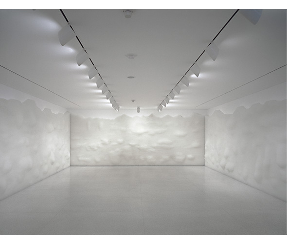
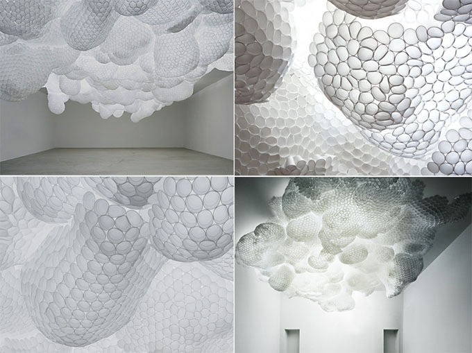
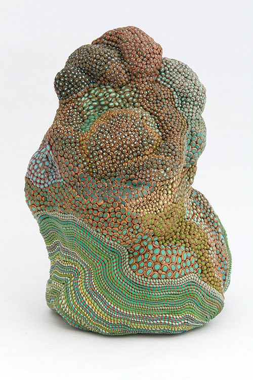
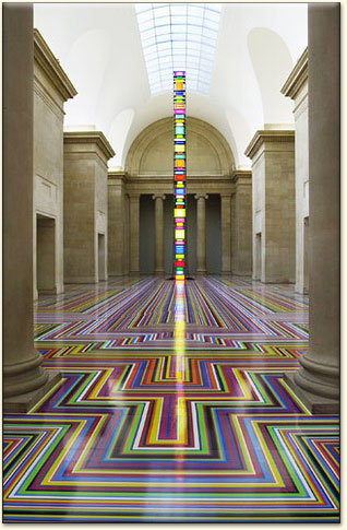
Sonja Vordermaier’s dramatic sculptural installations open the exhibition, their powerful presence capturing the audience, which leads on to the more subtle smoke tapestry by Pae White, the ephemeral quality and size of it transforms the long walls into whirling patterns of light and smoke. Upstairs the audience is greeted by more of White’s work, where the gentlest of movements could move the mobile, allowing the coloured discs to dance in the light. Moving on there are works from Eliasson, showing how light, colour, and the audience can transform his pieces and the space around them. Zimmermann’s brightly coloured drips automatically make the audience look up and question how they were made, as does the vivid glossy floor in the next room. In contrast to the colourful works seen on the first floor, the second floor features Donovan’s subtle installations which make the walls appear to be undulating, and the ceiling to be growing with clean white organic structures. The work of Saraceno finishes the show, creating web like installations, with magnificent structures that allow the audience to get up close and within the works.

Of course, although this has attempted to describe the magnificent nature, and understated wonder of these art works; the only way to truly appreciate these works is to experience them yourself.

Artists:

Sonja Vordermaier

Pae White

Olafur Eliasson

Peter Zimmermann

Tara Donovan

Tomas Saraceno

Curated by Amy Kirkham

Photos of the finished model!

Ground Floor


First Floor


Second Floor


I decided to create simple little models of the sculptures/installations, just so they refer back to the works. I've included an art works sheet and the plan with the model so it can be understood better! Also I didn't want to over-complicate the model (the lifts are little boxes/the stairs are plaited wire-simple) also, I wanted more of a focus on the layout and how the works would occupy the space, I wasn't too concerned with how the gallery looked outside, for me the virtual exhibition is about what's inside the gallery, and I've got nothing important to show outside.
Also I wanted to add that, there are lights/spotlights that are used within the works, they are shown in the images of the works (which sometimes also show how the audience affect the work).

It was quite fiddly, so I think it's successful in how I wanted it to be-to simply show how the works would be laid out.

Wednesday 27 April 2011

Updates

Because of the nature of the art works I'm exhibiting, and the fact that I've created quite a large fantasy gallery I've created a simple maquette that is effective in showing how the works will be placed, although it has been difficult to show the works which would be either on the ceiling or hung from it...I'm still trying to conquer that aspect....why did I choose to exhibit sculptures and installations?!

I've also been thinking about what the most important information to show is, I don't think the aesthetic of the outer building of my fictional gallery as I only created it as an inside space to display the work. Architecturally, perhaps windows are important but I won't have many in this gallery as there all the works will use lights on their work, either from the ceiling or from spotlights.

There are now several attempts at poster...none are successful. Sigh.

Another update, press release and maquette nearly done, I've also decided to use only White's Overneath in that space to give room for people to move around it.

Tuesday 26 April 2011

Transforming Dimensions

I really like the way this title sounds, it gives some indication as to what the exhibition is about but still leaves a bit of mystery, as it's not a completely descriptive title. I think it makes sense and is snappier than other titles I was thinking about; I was trying to be too literal.

I've decided. Transforming Dimensions. The title of my show.

Monday 25 April 2011

Press Release Ideas

Looking back at how we wrote our Press Release for the group show I've been thinking of ideas, and sentences that could go in my press release...


An exciting exhibition opens this May at The AVK Gallery, where visitors can escape from the mundane...(?) The exhibition comprises of six contemporary artists, working fundamentally with sculpture and installation.

Transforming Dimensions explores the variety of ways the white walls of the gallery can be transformed into a dramatic, colourful, and sometimes puzzling space.

The journey around this exhibition is one of a purely visual experience, one where the art works impose themselves on you and involve you in their work.

Sonja Vordermaier dramatic sculptural installations open the exhibition, their powerful presence capturing the audience, which leads on to the more subtle smoke tapestries by Pae White, the ephemeral quality and size of them transforms the long walls into whirling patterns of light and smoke. Upstairs the audience is greeted by more of White’s work, where the gentlest of movements could move the mobiles, allowing the coloured discs to dance in the light. Moving on there are works from Eliasson, showing how light, colour, and the audience can transform his pieces and the space around them. Zimmermann’s brightly coloured drips automatically make the audience look up and question how they were made, as does the vivid glossy floor in the next room. In contrast to the colourful works seen on the first floor, the second floor features Donovan’s subtle installations which make the walls appear to be undulating, and the ceiling to be growing with clean white structures. The work of Saraceno finishes the show, creating web like installations, with magnificent structures that allow the audience to get up close and within the works.

Of course, it is difficult to describe the magnificent nature, and understated wonder of these art works; the only way to truly appreciate these works is to experience them yourself.

Second Floor

TD's installations are made specifically for the space, so they can fit in whatever size room.

TS's works also work with the space, so I think they are adaptable to the size of the room.

First Floor

The two PZ pieces, the dimensions for FLOOR 4 (above) are: and I think GRAVITY will fit in the space, it seems a flexible piece in relation to size.


OE's pieces are perhaps easier to think about size wise as many use light and the dimensions for the one below are:
PW's pieces are in a certain structure, but I think I can gauge their size in relation to the gallery space.

Ground Floor

PW. I really want to use this piece but can't find the measurements of it anywhere! I'm guessing it is larger than Smoke Knows, so hopefully I can establish its size from that.


Smoke Knows, 2009. PW
These are the two SV pieces I'll be using, I may not display them exactly the same and again I'm unsure of the dimensions, however SV's pieces look as if they are installed and fitted into the specific space.

Layout


I've called my gallery The AVK Gallery, I thought seen as it was from my head why not call it after myself! Also I've enough trouble trying to think of a name for the exhibition. So here is the layout I've been doing....
I can't seem to get it any bigger! Very irritating as I've spent ages doing this and it's really helpful in showing how I want my gallery to be and where the chosen pieces are going!
I worked it out! The images at the top are bigger and hopefully more comprehensible!


I've been thinking about the sizes of the work in relation to the space, and I've been searching for the sizes of some of the pieces but I just can't find any! It's very frustrating as although some of the installations can work around the space, some like White's tapestry have a definite size.

Artists I'm using and further ideas...

Eliasson
Zimmermann
White
Donovan
Saraceno
Vordermaier
Arendt

I've found 2 works for each artist apart from Arendt, and I've been looking at her work and don't feel it works with my current plans for how the exhibition is going.

I was going to just not show any of Arendt's work, but I like a challenge so I've looked at my plans and I think I'm going to show Arendt opposite Vordermaier (even though that means I'll be showing 3 works of Vordermaier!) I think it's appropriate as there is a contast between the powerful piece by a window, and Arendt's softer piece, also shown by a window. However there is a relationship between two of their works that I will put in a darker room together, the more organic pieces.

Those are the only two artists I have put work together in the same room, this is partly because of coherence (so viewers can see the same artists work in succession) but also because of space and how many of the pieces need to stand alone in order to be successful.

Just looked at both Vordermaier's and Arendt's pieces again, I don't think they'll be successful in the space I'm creating. The space is too clean for Vordermaier's sculpture that wraps itself round the pipes, and using only one piece of Arendt's seems a bit pointless....I'll have to rethink the exhibition structure again.

Visual Dimensions

possible title?

I'm now also worried about how I'm going to 'reproduce' the sculptures in my maquette.
Difficult.

words that could inspire a title?

adapt
modify
transform
transforming the dimensions
regenerate the white cube space
visual - ocular
space - expanse - environment
ocular transformations of solid dimensions (silly as it kind of rhymes.)
transforming the ordinary space


Also currently thinking about how many works for each artist. For some artists I've chosen the works are so large that I think I should just use one of them, but for others I think more than one work is necessary. I'm also thinking about if it was a 'real' exhibition how I'd need to treat the artists equally and not favour one's work by using more of their work than others. I also don't want to crowd the space, I want there to be a fluidity to the exhibition, the works relate to each other but have their own individuality, I keep thinking that as my virtual gallery is three floors this could help with the slight distinction of the different works.

Tomas Saraceno and Tara Donovan


Tomas Saraceno

After seeing his work at the Frieze art fair I explored his past work and found it really intriguing!
I think his work, especially these I'm showing here, uses the space to it's advantage and like a spider creates this web that extends throughout the room. From images I've seen viewers have to work their way through the maze of 'webs' and I think that would be perfect for my show.


Tara Donovan

It is the first image that I'm particularly interested in using in my exhibition. The forms seem to grow from the ceiling, reaching out for the viewer. The use of light highlights the structural quality of the sculptures which I think makes them even more effective.
The use of plastic cups also shows another way of changing the space, by repetition etc.
Similarly I like the work using metal circles but looking at them again, I'm questioning whether they could work well with my theme...


Thursday 21 April 2011

Booooooom!...and other ideas...


A friend introduced me to http://www.booooooom.com and I've spent some time (perhaps too much!) browsing the art section, looking at the contemporary works. (it's a really helpful source of inspiration!)
The blog was created by artist Jeff Hamada from Vancouver as a place where creative people could look at exciting works and talk about them.
It's good because it doesn't show just one piece of work but a collection of the artist's pieces, and sometimes how those pieces work in the space.

I looked through the blog thinking about my idea and vision for the virtual exhibition and these are some artists I came across that related to it, and that I really liked!

Sonja Vordermaier

These sculptures don't just come out of the walls, they seem to violently protrude from the white space, they are not subtle change the space entirely. It's also interesting that it was displayed next to a window...I'm thinking on purpose perhaps? As the reflections are also interesting...

I like how this piece is not displayed in the usual 'white cube' setting which I thought would be necessary for my exhibition. Her sculptures are like mould, growing out of the space, and it's made me think about how I could display this work.

Because the piece above is gold and shiny it adds a different dimension to the space, the light reflects off it and allows the form to change the space both with its size and shape, but also it's surface quality.
I find Vordermaier's work fascinating! It's great to see how it works within a space and even how people interact with it.

Rebecca Ward


Ward's work has a much less organic feel to it than Vordermaier's, it is very structured, quite graphic in it's nature. I like it because of this fact, I like how it is not just organic forms that grow out of the walls, changing the space, more controlled forms can also be effective.

Beili Liu


I was drawn to Lui's work because of the similarities to Pae White's in that they are small discs hanging, however as they are made of one colour threads it gives them a different quality than to White's and I quite like the use of one colour, especially if it is in contrast to works that use many colours (or none at all!) I don't know whether it would not be successful to show Lui's and White's work together because of their similarities and how viewer's may be confused (or would that be interesting?)

Xavier Barrade


These rather space-like sculptures interested me as they seemed to hang in the space, yet look almost like a paint brushmark or something on a wall. For me they do look like something that was 2D transformed into 3D but I'm unsure what Barrade thinks. I don't think I'll use them in my exhibition, I can't see them working well with the other artists work.

Angelika Arendt

Again like Vordermaier, the first image is almost like mould growing from the space, and as I wrote before, I really like this for my exhibition. They are also quite vivid and colourful, and I'd really like to see an up-close image, although the smaller sculptures I saw looked as if they had been quite painstakingly made and took time; I like that.
Example:
Sculptures by artist Angelika Arendt


I've also been thinking of using Tomas Saraceno and Tana Donovan in my exhibition alongside Zimmermann, White, Eliasson (and perhaps Lambie), but after looking at these artists I think it would be exciting to use their work in the exhibition.

I've also been spending many hours just thinking of possible titles...no luck yet. I think the title is one of the most difficult decisions! I've drafted a possible press release (not ready for publishing yet...definitely needs a few tweaks!)

I've been trying to think of existing large white spaces I could use as a basis for my exhibition but I can't think of any that are suited to my proposed end result. I need a large white space, but with different sized rooms as I think many of the pieces work differently in different sized spaces, and as I'm choosing works that do change the space I'd be a bit stupid not to choose appropriate spaces for the works.


Words to help with title...

colour and reflection

reflections of colour

colour reflection light

how person changes the work

changing the space

Still not completely certain on all the artists I'm using...when I am perhaps I'll have better luck with title!


Wednesday 20 April 2011

Jim Lambie


I've looked at his work before, and I was just looking at the Tate website which describes his work...

Jim Lambie takes the ephemera of modern life and transforms it into vibrant sculptural installations. Working with items immediately to hand, as well as those sourced in second-hand and hardware stores, he resurrects record decks, speakers, clothing, accessories, doors and mirrors to form sculptural elements in larger compositions. Lambie prioritises sensory pleasure over intellectual response. He selects materials that are familiar and have a strong personal resonance, so that they offer a way into the work as well as a springboard to a psychological space beyond.

Lambie’s works are often devised in relation to a specific space, where they are shaped by a series of intuitive and improvisatory decisions. This enables him to work in tune with the qualities of his materials and the parameters of the existing architecture.

I think his work relates well to my ideas about allowing the art work to change the space, although I may not use Lambie's work, I could display works I choose in a similar way. It's his ideas about how his art work should be viewed that I find interesting...I've put the parts from the Tate description that I find particularly useful in bold.


Looking at past exhibitions...

http://www.moma.org/interactives/exhibitions/2008/olafureliasson/#/intro/


http://www.olafureliasson.net/exhibitions/your_chance_encounter.html - from photos this exhibition I can see how the viewers affect the work, through shadows etc.

http://www.peterzimmermann.com/ - this site is good as it includes exhibitions he has held,

some of his previous exhibitions have been in the typical 'white cube' space which I think is preferably for how vivid his own work is.

http://www.bbc.co.uk/dna/collective/A7440554 pae white, how she is part of a "new generation of artists exploring colour and space" "They’re spaced around in chunks so that the viewer can wander into and be surrounded by the strands of colour" "The room is filled with three giant hanging tapestries which depict photographic collage-images and crumpled shining foil. It’s a fascinating exploration of an ignored medium where the everyday becomes iconic."

I seem to choose to look at some artists who also use everyday items in their work, perhaps I really want the exhibition to take the viewer out of reality in that real items are transformed into something else, which in turn transforms the space!

I keep updated this post as I putting on websites I've found useful, it makes it easier for me to go back and look again at them.

http://www.sonjavordermaier.com/index.php?option=com_content&view=article&id=97&Itemid=169 a look at her range of works and which would be best in my exhibition, also I can see close-ups of her work. Interesting to discover that one of her pieces involves using CDs.

http://www.acegallery.net/artistmenu.php?Artist=8 irritating voice on the video but interesting to see how Tara Donovan creates her work, especially in a gallery space.

http://www.angelikaarendt.de/sculptures.html?p=9 can see more work and close-ups so can see surface texture.
Recently I've been looking at past exhibitions that the main artists I am interested in (Eliasson, Zimmerman, White) have been involved in. I've also been thinking about what space I would like to show them in. I have an idea in my head of a three storey building, where the lower floor incorporates a piece that uses the floor space, the middle floor is almost like a maze of rooms with different colours/lights works in them, and then the top floor will involve art work on the ceiling. I've done a sketch but unfortunately my scanner isn't working, but I'll find a way to put it up!

So now I'll be putting up information I've gathered about these artists past exhibitions and how they were curated.
I think their work will look exciting shown together but I wonder whether I should include more artists? Either use more artists and only one of their works, or use less artists and more of their works?

Thursday 14 April 2011

Pae White


I really like White's smoke pieces, the patterns and how she captures the lightness of the smoke really intrigues me. Could something like this work within my ideas for the exhibition? They are large, and involve light, they could be an interesting asset to my show.

Foil pieces could also work well as they could confuse the viewers' eyes; how is it made, etc.


These pieces are affected by the viewers presence, they are delicate pieces which sway when disturbed. They also cast shadows, and are full of colour.